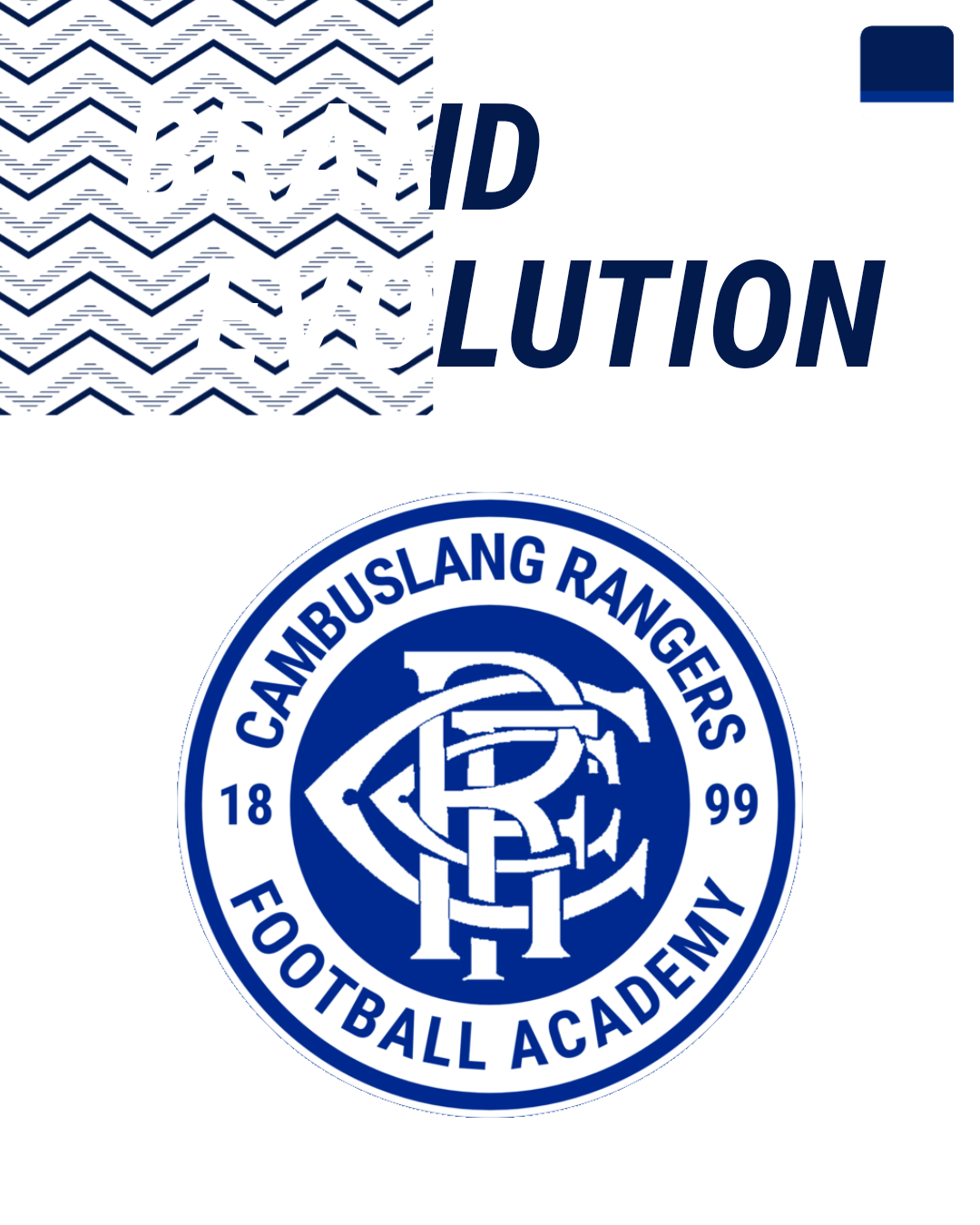
What Is A Brand Evolution?
A brand evolution is a revision and updating of a design which allows a business to modernise or tweak their brand identity marks.
Why Is A Brand Evolution Necessary?
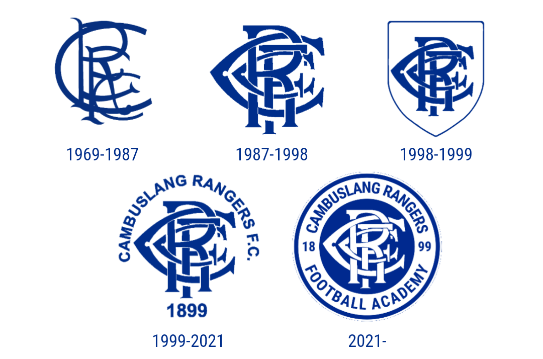
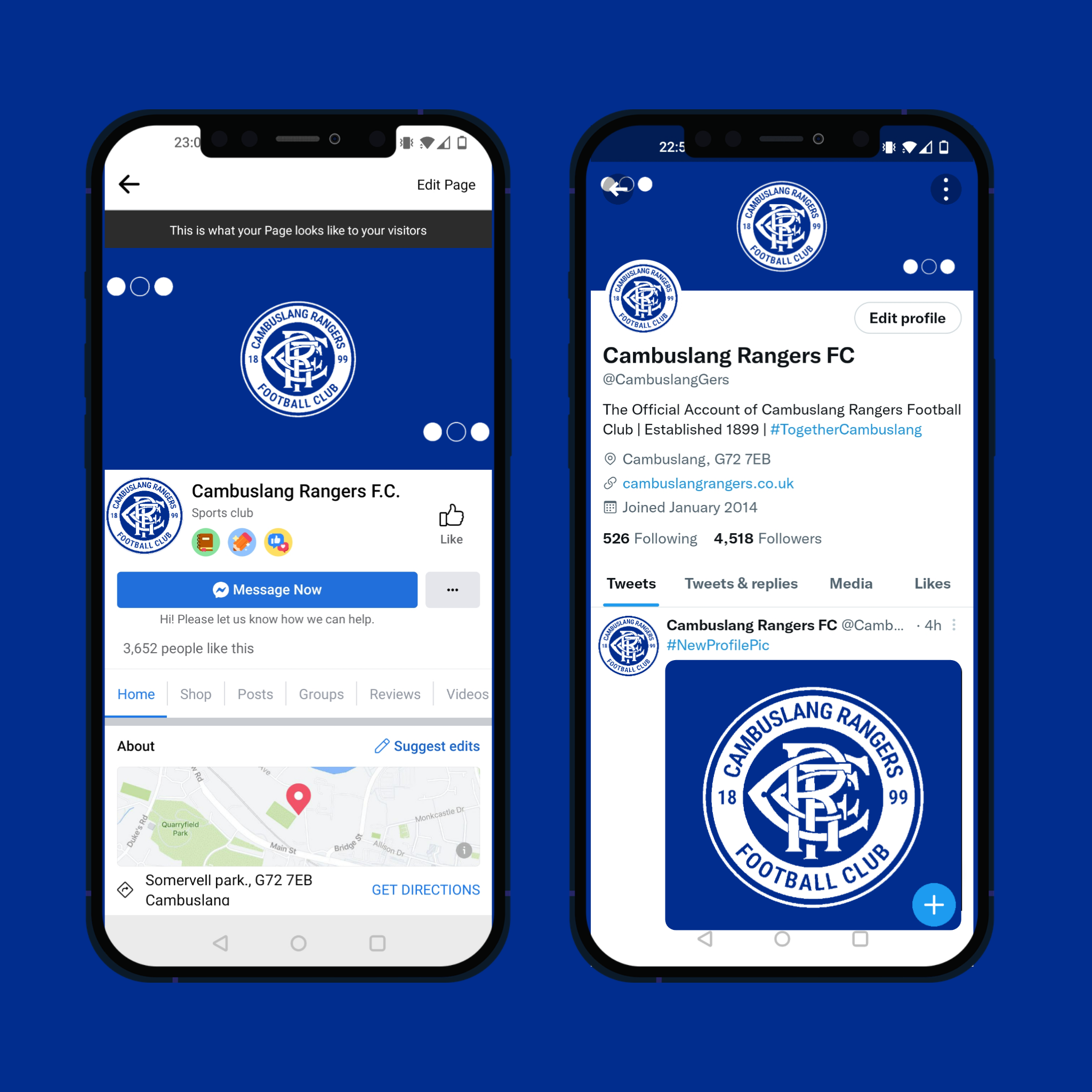
The club believe that by updating our brand we can bring together the iconic name, symbol & establishing year of Cambuslang Rangers FC and unify it into one single shape.
What Changes Have Been Made?
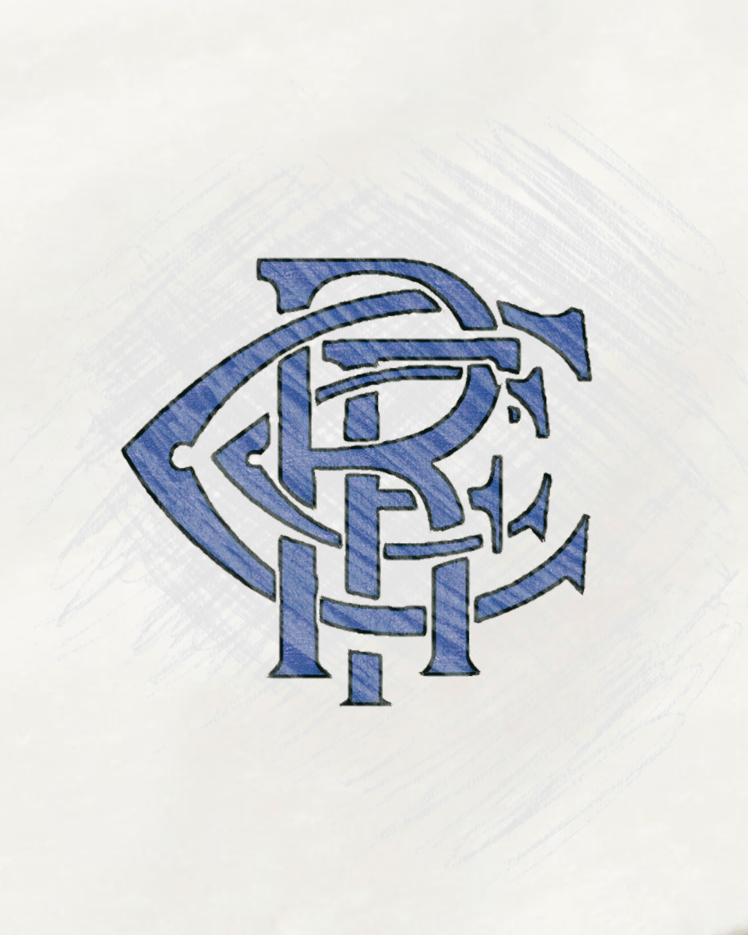
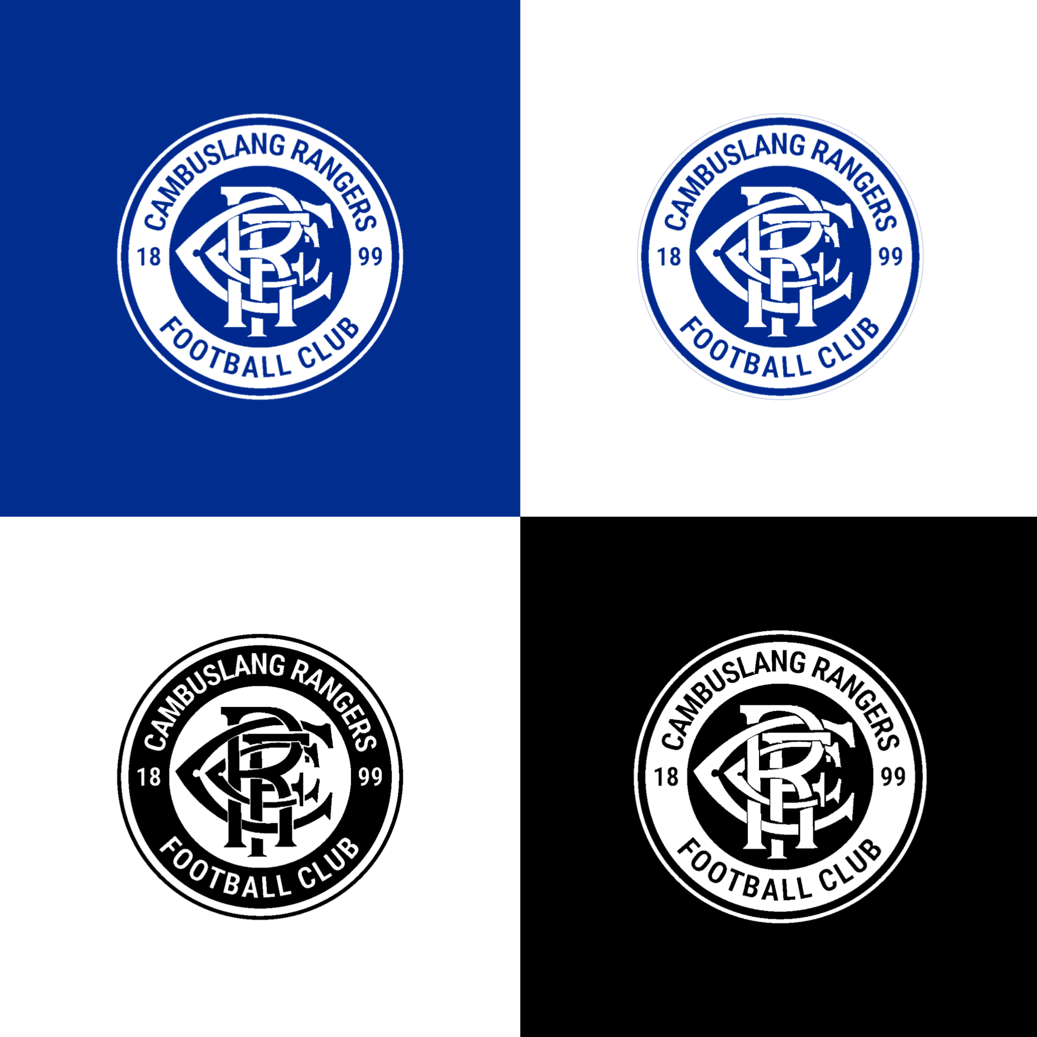
The most noticeable of chances is the emblem circle shape which compliments the former crest. I individual circle was the first aspect added to the new design with the concept of that being representative of the unity and togetherness of the club and community. We then looked to add a bold new typography which stands out to showcase our vision to pioneer for the future of this level of the game as we continue to grow. Minor adjustments were made to the original club scroll as we sharpened up the design to make clear the letters “C R F C” within the crest.
Have Any Other Changes Been Made?
In short, yes. Within our newly evolved brand identity we have introduced various new brand marks which will be present in future graphic designs and within our digital presence.
One of these marks is the '3-Circle' design which represents each of the original three merging clubs which formed Cambuslang Rovers FC in 1899 which quickly became known as Cambuslang Rangers FC.
Another of these brand marks reflects a river which symbolises our location in accordance to the River Clyde and the historical impact that Cambuslang had within the wider area of South Lanarkshire, and before that, Glasgow.